So said Warren Buffett several decades ago to his investment partners. At that time, the US stock market was ruling at an all-time high and Buffett's partners were worried about investing more money and/or remaining invested in the market. Buffett reasoned that its foolish to focus on absolute stock prices and absolute levels of stock market indices.
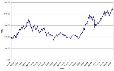
I'd say that the same logic applies today, here, in India. Yesterday, Nifty closed at 2,312, an all time high as the chart below shows:
But how high is Nifty really? Put another way, does "all time high" mean "expensive?"
To answer that question, I'd use a few different charts. Unlike the charts used by technical analysts, who look for trends, necklines and hemlines, heads and shoulders, penetration of tops and violation of lows, and the shapes of bottoms and other parts of the female anatomy they "see", my charts focus on one variable that, while not so interesting to the sexually minded chartist, is extremely useful to the buyer of values. That variable is relative value over time. Its foolish to think of stock prices as high or low in absolute terms. Just like a cow is bought for her milk, stocks are (or should be) bought for the underlying earnings of the businesses to which they belong.
The chart below looks at the movement of the Price/Earnings ratio of Nifty over time. In other words it measures how many rupees has the market been willing to pay for ever rupee of corporate earnings in Nifty. 
The above chart clearly shows that even though the stock market may be quoting at an all time high, the market value of every one rupee of corporate earning power is nowhere near its all time high. Indeed, at its current value of 14.69, Nifty's P/E multiple is 33% less than the P/E multiple of 22.01 in March 2004 and 48% less than the peak P/E multiple of 28.29 in March 2000.
Now, take a look at another chart in which I have plotted both Nifty as well as its P/E multiple over time. 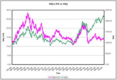
The green series reflects the Nifty and the pink one reflects Nifty's P/E multiple over time. The chart shows that even though stock prices have risen, P/E multiple has declined. Moreover the gap between the green line (Nifty) and the pink line (Nifty's P/E) has never been as wide as it is at present. How did this happen? The answer is quite obvious. Corporate earnings have grown far more rapidly than stock values and a result the market is now paying a lower amount for every rupee of earning power as compared to what it was willing to pay in the past. This can mean two things. Either the earnings growth has to decline in the next few quarters or stock prices have further room to rise.
Given the current strength of the economy, the chances for growth in volume of sales and profits, appears to me to be very good. This is not an expensive market to invest in. Indeed, given the likely scope of future earning power growth and low interest rates it can easily be argued that a significantly higher P/E multiple for Nifty is warranted. Morover, deep value stocks of fast growing companies available for acquisition can be bought today at P/E multiples which are typically less than half of Nifty's P/E multiple of 14.69.
Here's another chart that plots Price/Dividend ratio of Nifty over time. Price/Dividend ratio is the reverse of dividend yield. I like P/D because it is a subset of P/E and its often more useful to invert a much-used ratio.
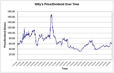
The above chart confirms the conclusions drawn earlier. The current Price/Dividend ratio of 61.73 is way below peaks reached in earlier bull markets.
So, my net conclusion is this: Given recent performance of the corporate sector, and given the sustainability of this performance, the current level of interest rates, the Indian stock market is not expensive.
In other words, "Stocks are high, they look high, but they're not as high as they look."
Sanjay Bakshi
http://www.sanjbak.com/